Wednesday, August 31, 2011

CD Packaging: Developing - Fold it


Going with my best idea, which is the origami box, for developments in to a final folding pattern I would have to learn the mathematics behind them in order to modify and create my own crease pattern for the box.

Before I jump in to that though I'll explain why origami box is the best idea for me.

In the previous project the concept was human presence and sustainability. I went more for the sustainability part and how our installation was made. We constructed it using trash and various found objects, including the wood which was also trash.

I also thought about wastage of materials in choosing the origami box. If you go around the supermarket and just pick a random box of product, I can tell you that to me it is an annoying stupid design. What's the point in having a box when it's annoying to open because the flaps sometimes rip and because after you open it you still need a rubber band to close it shut anyway? Also, the inconvenient design also wastes a lot of the material it's using because some bits aren't even functional.

If you're going to use more material I think every part should serve a purpose. This is why origami is a great idea. It minimises wastage of material because every area has a use so it is not wasted.

I could also use found materials to make it as well, which would relate back to how my group and I made our previous project. At first I was thinking of making my own special paper to use, that's a maybe. At the moment the material I'm most likely to use is stiffened fabric.

A key issue in sustainability is things lasting for a long time. I want that to be the same for my design. I don't want the packaging to be completely worthless after people simply stop using CDs. Thus, I want the packaging to have multiple uses besides storing CDs so that it can still be useful after CDs fall into disuse.

Now back to crease patterns in development. As I said before I'll have to use existing crease patterns as a base to begin my own modifications. These are the designs which I will learn from, which I folded today.

I made three categories of the designs I chose to study. They're pleated, helixes, and S-curves.

I chose a selection of pleated designs to do developments on because as the name implies, in pleated models you have the pleating of paper. This pleating joins up where the box closes with radial geometry and gives the self-locking property I'm after. Meaning that it can stay closed by itself.


From left to right and top row to bottom row: 32-sided tato, 17-sided tato, 8-sided tato, pentagonal petal tato, octagonal tato with modified bottom.

A close-up of the 17-sided tato. The part in the middle is the self-locking point where the flaps cross over each other and keep each other closed.


Helixes are really amazing. The reason I chose some helixes is because they can collapse and expand according to their own helix structure. This allows for the model to fit anywhere depending on the size. I was also thinking that if I put slots into a helix structure I could put in multiple CDs and can later use them to hold other flat objects like people's contact cards.


This is the multiple layer, octagonal helix.


And this is a one layer helix.

S-curves are beautiful and elegant. They're also surprisingly simple to achieve. What happens with S-curves is that the edges folding out are actually straight believe it or not. The edges folding in are curved, and when they work with the straight edges folding out, the curves warp the straight edges into the curves you see on the models below. The only exception down there is the bowl, since both the inside and outside edges are curved. That one was folded to understand how S-curves work.

From top to bottom and left to right: peppermint drop bowl, smart waterbomb, onion, and 7-sided tato box with curves.

For folding these paper models I got the crease patterns from Philip Chapman-Bells' blog. (Chapman-Bells, 2010) The exception is the 8-sided tato which I got from Jorge Jamarillo. (Jamarillo, 2009)


_______________________________________________________

Chapman-Bells, P. (2010). The Fitful Flog. Retrieved August 30, 2011, from http://origami.oschene.com/

Jamarillo, J. (2009). Petal Box CP. Retrieved August 30, 2011, from http://www.flickr.com/photos/georigami/3193396658/


Tuesday, August 30, 2011

CD Packaging: Concepts

Started making concepts today. I had some in my head and I drew them down, then had a look around online for inspiration. I found that my two favourite ideas have already been done though. However, I'm not going to panic on that. Just because something's already been done doesn't mean I can't make it new and distinctly me. A lot of the time I've found that people in general when it comes to art and design are a bit obsessed with being "the first" to do something. But that's just unrealistic. And why should you be so concerned about something already done before? In my opinion, it doesn't matter whether something has been done before as long as you do it YOUR way. If you do it your way, it will naturally be different from everyone else's.


My favourite idea is using origami to create the packaging. Personally, I really hate packaging where there's excess useless bits of paper that are flipping inconvenient to open. Origami uses ALL the paper. In particular, if it's radial geometry in the specific origami design the top will "self-lock". Meaning that the flaps can lock into place by crossing over themselves according to tangents to the centre of the circle. It makes it easy to open as well. A little twist and it opens and closes easily. The design above is an example of this though it isn't purely origami up there. (wewow ltd., 2010) That one is more of a net that cuts out areas in between it's little flaps to make it easier to fold. Pure origami doesn't use any form of cutting, as it is strictly folding of paper.


This is an example of a pure origami CD case, there's no cutting involved at all. I'd like to do something like this, maybe come up with my own origami design to suit my specific requirements. I think that's what will happen in the development stage. I'd of course have to make existing origami designs first to understand how they work in order to make a design of my own which can work for me. Will need to do calculations and ratios again to get a working design and to figure on which side can have graphic designs printed on them and how the graphics should be designed.


My second favourite was the book idea. Sections are cut inside a book which you can then put the CD in to. In my concept for this one I want to use old books to make the casing and paint the cover with my graphic designs on to. The example above uses the entire book in the design turning it into a visual story book with the CD art clearly being a part of the book. (jordan, 2011)


Here are my seven concepts.


This
has nothing to do with this project, more like personal interests. The onion; I love it. Looks like Taj Mahal to me. Very beautiful curves. Here's the folder's blog as well, which could teach me some things if I go with the origami idea, which I probably will because it's my favourite one. In their blog they teach you how to fold more complex origami models and explains the mathematics behind various structures in origami.


_________________________________________

jordan. (2011). Chris Tarry Rest of the Story CD Packaging. Retrieved August 30, 2011, from http://jordannews101.blogspot.com/2011/04/chris-tarry-rest-of-story-cd-packaging.html

wewow ltd. (2010). wewow launch creative, eco-friendly CD/DVD packaging solution - WowSpiral. Retrieved August 30, 2011, from http://eco-cd-dvd-replication.typepad.com/wewow_industry_experts/2010/06/wewow-launch-creative-ecofriendly-cddvd-packaging-solution-wowspiral.html

Friday, August 26, 2011

Design: Crit Session + new brief


Here's my finals for the business cards.


I'm quite pleased with how they turned out, other than a few things that I didn't like about them.

Today was the crit session and I have to agree with the feedback that the typography is in fact on the weak side. I think I definitely could have done more with the type and experimented more with the type. In the concepts and developments the typography was never sketched out and were just placed with squiggles to show where the type is going. I think it may have been more beneficial for me to actually write in the typography in normal handwriting just to see how it would look. I think that would work with me better so that I can see what's happening with the type and the possibilities on how to use it more easily.

I think I also need more practice with Illustrator, I'll have to use it more to fully understand how it works and not rely on PhotoShop so much to do these designs.

Overall, it was a reasonably good effort and this exercise showed me what I need to pay attention to more for our new brief and specific weak points that I need to focus on when designing.


As for the new brief I have to admit that I am disappointed that it leads on from our previous project. I was hoping to break away from the last project and do something new and fresh. Nonetheless, effort 100% as always whether I like the brief or not. For this one, I'm hoping to incorporate origami into making the CD packaging, which could get interesting. More research on that later.

Thursday, August 25, 2011

Design: Day 2

After finishing up the 15 concepts I realised that a lot of them were quite similar. So I went back and drew up some additional ones so that I had a better range to select from for the development of two concepts.

For developing I wanted to make the information on the card more fun to find. So in one selection you have to tear away her hair to get to the contact details. In the other the card is like a little envelope, you have to open it to get to the information. In both developments the goal is to make the designs more beautiful with visual interest and to make the finding of the contact details more enjoyable than normal, conventional business cards.


Wednesday, August 24, 2011

Design: Day 1

Some inspiration of business cards that really stand out. I don't want to make a boring flat piece of paper. It should be more interesting than that or else nobody is going to remember your contacts. So for me I'll probably try to stay away from conventional, flat rectangles.

I drew up some really quick sketches that were to do with hairstyling/hairdressing first to find all my options at the beginning.


Then I picked out my favourite ones to expand on to see what I could do with them visually.


After that I began to plan out some concepts, but first I wanted to get some inspiration on making interesting business cards as opposed to a boring rectangle with text on it that maybe has a tiny little picture which does nothing to make it more interesting on it.

There were several different cards which I thought were really interesting. I think they're quite charming too, so if I ever got one of these given to me I wouldn't throw it away. I want my cards to be like that; something people would want to keep and remember.

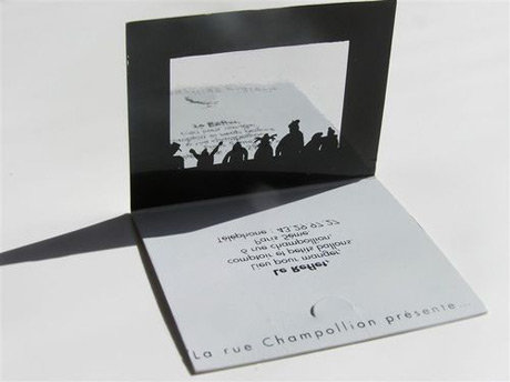
This is a fold-out one which I really like. It feels warm and at home because it has a 3D look due to the fold-out and because the graphics is in a hand-drawn style which makes it more personal. (Venus, 2008)


This cut-out one is very relevant to the person I chose. (Betterprint, 2011) I did the hairstylist/hairdresser one. I like this one because it lets the person you're giving it to add their personal touch to the card. I think it really relates to hairdressing other the cutting action since when you go get a haircut you add your own personal touch to your style by telling your hairdresser what you want.


I thought this one was lovely because the card actually does what the client does: puts things back together. (Mail Digi, 2009)


I like how the fold-out in the middle makes the flat space of the card work for it here. (Ivan, 2008)


These ones are just delicious. (McKenna, 2009) Business cards made of food for chefs, bakers, cooks, and so on would be perfect. It's like giving a little sample of what your food tastes like. So if somebody liked the taste of your business card they'd HAVE to remember you and come back for another taste.


__________________________________________________________________

Betterprint. (2011). Betterprint: Business Card Hall of Fame. Retrieved August 24, 2011, from http://betterprint.tumblr.com/page/2

Ivan. (2008). Cool business card designs, Part 2. Retrieved August 24, 2011, from http://creativebits.org/cool_business_card_designs_part_2

Mail Digi. (2009). Creative Business Cards. Retrieved August 24, 2011, from http://maildigi.com/creative-business-cards/

McKenna, J. (2009). 52 More Unique Business Card Designs. Retrieved August 24, 2011, from http://www.reencoded.com/2009/02/18/54-more-unique-business-card-designs/

Venus. (2008). 20 Clever and Creative Business Card Designs - Part 3. Retrieved August 24, 2011, from http://www.crookedbrains.net/2008/08/interesting-and-creative-business-cards.html


Tuesday, August 23, 2011

Nightingale floor: Exhibition day


Today was exhibition day, so most of the time was spent prepping for the night. We had to do the wiring on site so that it won't be such a hassle watching out for the wires when we're moving the two sections. Ben connected the two sections together and Jenna taped up the piezos into position on each plank for optimum vibration detection.


I connected the wires to chocolate blocks and then Jenna connected the other end of the wires to the Arduino.


And this is us testing out the floor. At first there were some glitches with which planks activated which sounds. They got a bit mixed up and at first some of them weren't responding quite so well.


However, in the end we got it working right on time. It turned out really well I think even though the program started frying up a bit when loads of people went on it at a time. It still worked nearly as well as we wanted it to though. Too many people on it actually made it sound more random and chaotic and made the distortions sound more obvious. This, I think was a good thing. So overall, I'm proud of my group's work and I think we did the best we could with all the time and effort we put in to that floor in a short time.


Now my favourites! I'll talk about my top three in no particular order.

My top three was double Cory, Chris + Josh, and Lee's group.

I loved how for double Cory the sound was inside the room and it really sounded like what they were going for. Sounded like there was something human and horrible was happening in the room and I like how you had to press your ear on the door to hear it more clearly as well. I think it was effective in evoking some strong imagery which works well with their concept on war.

Chris + Josh made some really beautiful sounds with their synths, I love the crescendo throughout the whole thing.

For Lee's group I enjoyed how scary it sounded. They used the space really well too, enhancing the atmosphere with the added light and the fan to create shadow.


Some other ones that I really liked was Nick's group and Jason's group. I really liked the salt water connecting the switches for Nick's group. I thought that was really interesting. With Jason's group I liked how personal their idea was to the history of the building.

And here's a recording of what my group's installation sounds like on its own, click the link to hear it.


Contribution:
We put so much effort in to this installation and I am so proud of what we've achieved in a short time.

As for individual work we did not have many blurred roles, there were some distinct ones. In this installation I was the mathematician, artist, and secondary fabricator.

While the structure of the floor was being decided upon a basic plan was needed with all the required angles and measurements in order to know what was the best way to build it. So using simple knowledge of angles and parallel lines I calculated all the angles that we needed to know and calculated the ratios between measurements of the lengths to work out whether we had enough wood or not to create a proper frame. During fabrication simple divisions of angles were also used in deciding where to cut the wood so that the angles were maintained. At first I forgot to do this, so to fix the problem, which widened the structure horrendously, I corrected the angle and Ben recut that particular length of wood.

As the artist I did the decorating, Ben did decorating as well. My main role for decorating at first was folding enough roses to put on to some of the planks, then I attached various materials as required to the planks to complete the look.

As a secondary fabricator I helped Ben up at the 3D labs in cutting the wood and putting it all together. I also helped Jenna with the wiring before the exhibition.

Monday, August 22, 2011

Nightingale floor: Weekend

In the weekend we came in to test out the program and to do more decorating.

Jenna got the program working really nicely. The piezos are attached in a way that makes it impossible for any kind of footstep to be undetected. Even my lightest footsteps triggered them and I'm the lightest person in the class. So we're really pleased with that.

Got most of the decorations finished off as well with most things stuck on. Then today Ben and I went up to the 3D labs to nail gun the fabric to the planks.

Need to do:
-Hot glue down remaining polystyrene on a plank
-Find more trash to put underneath planks in the visible holes
-Sufficient prep for tomorrow's exhibition