I looked at examples of Minimalism in various mediums. I picked out some artists whose work I found interesting and had a look at their process as well to see how it would relate to my work.
John McCracken
A Minimalist
sculptor who creates wall pieces as well as freestanding sculptures
of various geometric shapes and sizes. His pieces are made by hand
using industrial materials such as plywood, sprayed lacquer, and
pigmented resin. This gives his works a highly reflective, sleek
finish for which he is well known (Zwirner, 2011). His signature
sculptural form is the plank in monochrome colours leaning against a
wall while stood on the floor. The planks embody the way he thinks of
his pieces as abstract objects existing between two dimensions: The
ground representing the physical world of material objects and the
wall representing the spiritual world of ideas, imagination, mental
space and so on (Royal Botanic Garden Edinburgh, 2013).
He is interested
in how his work relates to the space and the viewer. His is
especially interested in the idea that his work is something that is
an object born out of a different dimension. I see his works as a
pure, crystallised form of this idea.

Above is Teton
by John McCracken. It is my favourite example of his work because it
shows his fascination with how objects relate to space and people as
an abstract thing in the simplest way. The idea of different
dimensions is boiled right down to this lone column. Yet it expresses
the idea in a big way because of how it responds to the environment
by reflecting it. Teton
is made from stainless steel polished to a high degree to give it
that mirrored look (Zwirner, 2011). It is in a forested area where it
reflects its surroundings making it almost invisible. It is only seen
as a strange distortion in space. That is interesting to me because
it makes the viewer look twice and really think about their
surroundings. For example, what is seen and unseen in a particular
place. If I stumbled upon something like this I would be on the
lookout to see if there were more around. On the other hand though, I
think if there were any more columns it would be too much. One column
here is more effective because it’s almost like it’s a glitch in
reality rather than something planned and set out in a certain way.
If something looks weird or out of place it would make you think
about why it’s there and what it means even if it is almost
invisible.
Painting:
Ellsworth Kelly
A painter and
sculptor famed for multi-panelled pieces featuring saturated colour
and precise geometric shapes. Edges in paintings are sharp and
precise, suggesting seriousness in creating perfection of form. In
Kelly’s work he wants the viewer to have an instinctive, physical
response towards the features of the painting itself rather than a
response to the painting as a representation of an idea (Gershman,
2013).
This is
interesting because with McCracken, his works represent an idea of a
different dimension. However, Kelly’s works are meant to be seen
and accepted as artworks for what they actually are rather than what
they represent. They are independent from context and interpretation.
I like the idea of seeing something, an artwork, as what it is here
and I think this is where the beauty of simplicity lies in Kelly’s
work. For me it brings a feeling of peace and freedom. These feelings
I have for Kelly’s work are most evident when I see his botanical
drawings.

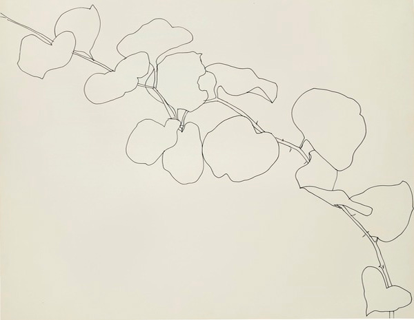
His drawings of
plants have simple strokes, muted colours and reduction of details
leaving the contours of the plant. He sees these drawings as
portraits of specific plants he found, associated with a memory and a
place (Laurent, 2013). In a way, the plants have an identity as a
specific plant instead of being a member of a specific species. This
leads back to seeing the artwork as what it is rather than what it
represents. The reduction of a plant into simple lines makes it feel
peaceful to me.
The process he
goes through to draw these plants also shows me how I could apply it
to my own work. He finds a plant that he wants to draw and he draws
it. He doesn’t spend a laborious amount of time on it because he
wants to get the “freedom of the line” and “swift curves” in
the plants (Sobieski, 2013). I should emulate this process because if
you can draw something simple while still giving the drawing clear
readability of what it is, you have the building blocks to create
more from it. It would also be a good exercise in drawing form.
Photography:
He does
minimalist portraits of people. His specific body of work titled YOU
is about people and how we inspire each other through our perceptions
of others (Hiltermann,
2013).
The portraits taken in YOU are
of people without any kind of mask. Their faces are naked from makeup
and accessories. They are laid bare for all to see. During the shoots
the people were also told to look into the camera as though they were
looking into the eyes of someone they were completely comfortable
with (Sayer,
2013).
The
portraits seem honest and they depict the essence of the person. So
the portraits themselves
have more to say about the viewer rather
than the actual person. The portrait becomes a kind of mirror,
reflecting the viewer's judgement as a piece of themselves in another
person.
Here, I think the
relationship between the viewer and the work is really beautiful.
It's beautiful in that the person you're looking at and how you see
them says more about you than the actual person. So it really is like
a mirror. I especially admire the stark honesty of the portraits in
portraying the person as just a person without any kind of mask. I
think the removal of
extra details like a smile, makeup, accessories and so on in
the minimalist portraiture here gives it the viewer room to fill in
the gaps to make sense of the person themselves. This is what I think
is interesting. The suggestion of something rather than a flat out
statement. I find that this method is more powerful than directly
giving out all the details in a very controlled way.
Kenna, M. (2006). Copacabana Beach, Rio de Janeiro, Brazil. Retrieved from http://www.michaelkenna.net/gallery.php?id=17
Michael Kenna takes Minimalistic photographs of hauntingly beautiful landscapes. His photographs are made by taking long exposures of up to 10 hours long, usually at dawn or dusk when the light is most pliant (Bellows, 2013). His work is about the setting as a stage. An impression of a place where stories happen. He sees his work as an invitation for the viewer to explore the landscape with their imagination and make up their own stories of what might have happened in that place (HolgaDirect, 2012). For me this is interesting because rather than putting all the characters and objects of a story inside he strips it all and leaves behind the stage. This could be quite an interesting way to tell a story in one image. Leaving behind the scene but removing all the characters, encouraging the viewer to make up their own minds as to what happened.
In another interview Kenna talks about attaining a style. He said that finding your style in art is about finding yourself because each person is unique in that their perceptions are shaped by their different experiences (PhotographyMonthly, 2010). Another way to develop style is to emulate the style of people you admire. The traditional way he processes his photography is also derived from photographers he admires. For me I think this is important. Because in all honesty I don’t feel like I know enough about myself. Thus, finding my way through drawing and making more art could be a way to get to that. In addition, it would help create a distinctive method to tell a story in one image.