I joined Andy's project that has an interesting focusing question: How to tell a story in one image?
The medium we use to do this project is completely open. At the moment I'm still deciding whether I want to do photography, digital art, cinemagraphs, or a combination of two mediums. Maybe have different sets of mediums expressing the same story and see which one is more effective.
The key theme I want to explore is inspired from a section from the documentary Objectified by Gary Hustwit (2009). The documentary is about the relationship between the users, the manufactured objects and their designers. Dieter Rams was one of the various designers interviewed. He said that "good design is as little design as possible."
Going from that quote it resonates well with me because for me it says "Less is more". So my key theme for the project is minimalism. How to tell a story in one image as simply as possible, using as few elements as possible.
I made a short search to look at examples of minimalist photography on the internet. They feature strong lines, interesting textures, geometric shapes, and strong sections of colours. Most of them don't tell a story. The ones that do rely on symbolism and implication to tell a story. Careful composition and lighting, I imagine, would also help.
My favourite example is this picture below.
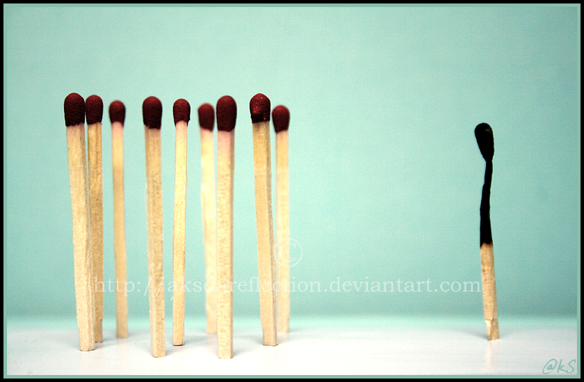
Figure I. Khan, J. (2008). Racism ... IV. Retrieved from http://ahmedwkhan.deviantart.com/art/Racism-IV-81071008.
Here the burnt match is ostracised by the other matches for its differences. This theme remains constant despite various interpretations of what those differences are. A commenter suggests that it is about age as the long match is burnt and useless, which is eventually what happens to the other matches. Another commenter argues that it is merely the colour of the match. It conveys the theme of racism in a very succinct and clear way. Using as few elements as possible.
However, is there a difference between conveying a theme, a message, and a story? I think this distinction is important. A theme, for example, would be an idea or concept. Such as sadness. A message builds on a theme to express an opinion of some kind that the viewer is supposed to take from the picture. For example, "sadness is painful". A story, I think, grows further on the message. Fleshing out a full set of details. "This person is sad because this happened, and now they're doing this." I wonder if it's possible to differentiate between a theme, message, and story between pictures. Or maybe in every picture we are predisposed to making a story of our own?
Reference List
Hustwit, G. (Producer & Director). (2009). Objectified [Motion Picture]. United States: Swiss Dots.