Wednesday, May 29, 2013

Optical Illusions


In the previous RGB test it didn't quite work out and I considered looking into optical illusions as mentioned before. I looked at some illusions but they didn't quite fit into what we're doing. Most of them involved staring at a dot so that the illusion could work, which is what we don't want. There were some very amazing paintings that don't form its shape for you unless you're at a specific perspective, these are called anamorphic paintings. However, one particular illusion is relevant to what we are trying to achieve.


In this video (brusspup, 2010) an animated optical illusion is shown where black bars move across black lines, filling in the gaps to give the illusion of a moving image from a still image. I thought this might be useful because it captures what I think animation is very clearly; an illusion where images flick by so quickly that your brain tells you it's moving.

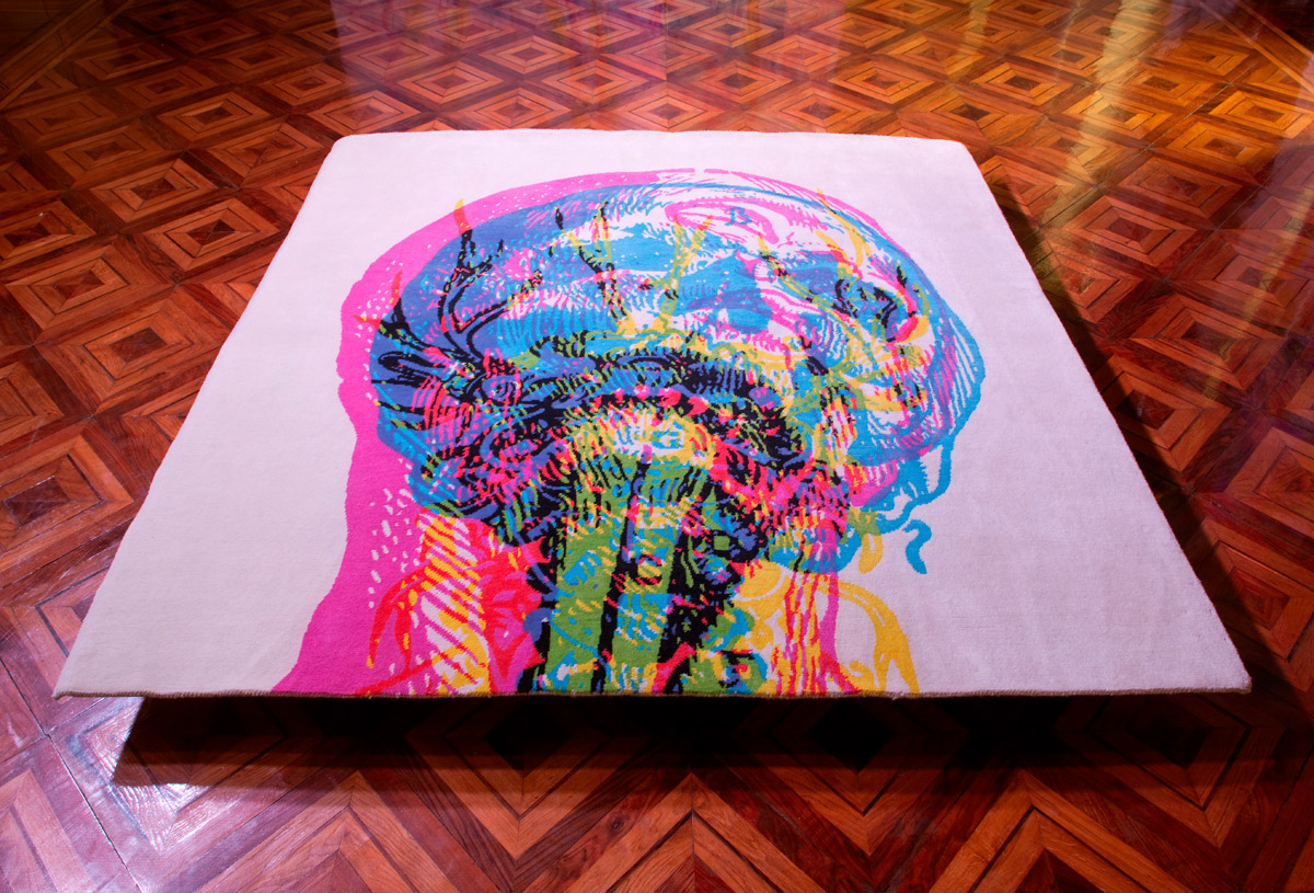
It can also be made in 3D as shown by this product designed by John Leung (2011).


I've seen some like this before where the bars are printed on another layer a certain distance away from the bottom layer. Then when you move around, it appears as though it is animated as your perspective changes. This neat rug and coffee table uses the same concept.

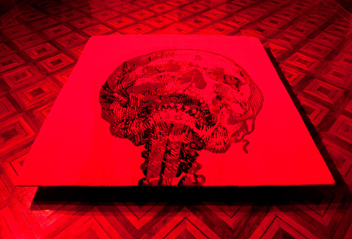
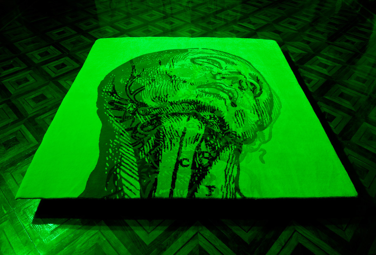
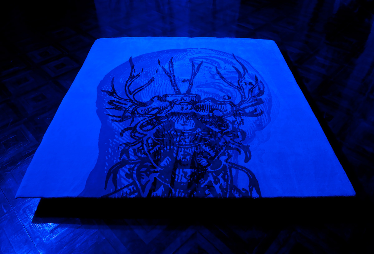
At the time of looking at this type of optical illusion it was intended to replace the RGB light that didn't give the best results. However, after talking to Andy about it as a group we found that it was the RGB light that I had before that pulls all our components together into a package. So the focus should be how we should use what we've got and see what we can do with it. I did more testing with different colours and there were more printed colours that do pair up with certain colours of light. There aren't enough for a full length, complex animation, but there are more than enough to do one of these optical illusion animations. In the next post I'll go into more detail about the presentation and the new RGB light test I did.


Reference List

brusspup. (2010, May 30). Amazing Animated Optical Illusions! [Video file].
       Retrieved from http://www.youtube.com/watch?v
=Dq1ms2JhYBI&feature=related 

Leung, J. [johnleungdesign]. (2011, November 25). Magic Carp-pet @ Red Dot Design Award 2011 [Video file]. 
       Retrieved from http://www.youtube.com/watch?v=Ua7HOX32PGA


Tuesday, May 21, 2013

Testing RGB leds and Printing

This morning I did tests to see for myself how different colours show up on print with different colours light like in Carnovsky's work. I didn't expect it to work though because I couldn't print true cyan, magenta, and yellow colours since they were out of gamut for printing. I need to know more about colour management and printing to see if there's a way to get around this.


There's a simple Arduino circuit I set up. There really should be some resistors on each leg of the RGB led, but since this is a quick test I'll skip out on those for now. As you can see here the printed colours aren't the ones I want. I folded up the paper so that the light can be contained in the box so that I can see what it's doing to the colours better.


The red worked really well, which surprised me. As expected cyan turns black when red light is shone on it. So if we're using red light it can turn out pretty good.


Green and blue light however, didn't work well at all. But they did turn Magenta and yellow to black respectively.


I tried it out with highlighters too on the off chance that maybe it would work or at least look interesting. Didn't really work though and the results were garish. Highlighters are not an option.

With the RGB led I also looked at cycling through the colours. I found an example by jamesotron (2013) which is a small, clear piece of code that makes it easy to understand how it cycles through the colours. Basically it fades each of the three colours at different times, which give you the smooth transitions. At this stage I don't need the colour transition because it's not necessary yet. Maybe it would be something to consider if we still use RGB and connect it up to the gears to move through the spectrum.


Reference List

jamesotron. (2013). Arduino sketch to cycle and RGB LED through the colour spectrum. Retrieved May 16, 2013, from https://gist.github.com/jamesotron/766994

Sunday, May 19, 2013

Carnovsky's RGB murals

Figure 1.  An example of Carnovsky's work under normal light. Retrieved from http://www.carnovsky.com/RGB.htm. Copyright 2012 by Carnovsky. Reprinted with permission.


Figure 2.  Cyan layer revealed by red light. Retrieved from http://www.carnovsky.com/RGB.htm. Copyright 2012 by Carnovsky. Reprinted with permission.


Figure 3.  Magenta layer revealed by green light. Retrieved from http://www.carnovsky.com/RGB.htm. Copyright 2012 by Carnovsky. Reprinted with permission.


Figure 4.  Yellow layer revealed by blue light. Retrieved from http://www.carnovsky.com/RGB.htm. Copyright 2012 by Carnovsky. Reprinted with permission.


Carnovsky is a pair of artists, Francesco Rugi and Silvia Quintanilla, who created the work above. As stated by Carnovsky (2012), this particular body of work is about experimenting with "the interaction between printed and light colours". In the first image, that's what it looks like under normal light. A chaotic mass of lines that you can't make proper sense of. You see one thing, but wait, there's more on another layer that you can't quite make out. However, each layer is revealed by shining red, green, or blue light on it.

For example, when you look at it there are three colours on the printed work: Cyan, Magenta, and Yellow. Each interacts with the colours of light: Red, Green, and Blue. This works within the limits of human colour vision. We see colours in RGB (red, green, blue) values. So every colour we can perceive are a mix of these three colours. When each light is shone on the printed work it would only show its corresponding complementary colour.

Red light shows the cyan layer on the printed work, green shows magenta, and blue reveals yellow.


I appreciate their work because it plays with the natural capabilities and limits of our vision. It could be interesting to look into what our eyes are capable of and our limitations as part of the interface and how people interact with the project. Could it also play with our perspective on how we see things and how we understand them?


Reference List

Carnovsky. (2012). RGB. Retrieved May 15, 2013, from  http://www.carnovsky.com/RGB.htm

Friday, May 17, 2013

Light and Seeing


After a long talk with Gerbrand and Daniel we've narrowed down our focus a bit. For my part we went on to talk about light after I showed them some examples of Petros Vrellis' work. His work is what inspired me to work on the bridge and do some programming for the project.

His most famous work is a beautiful animated Van Gogh painting where the animation also creates a soft twinkling melody on its own. Since then he has adapted his work to go on the iPad due to popular demand, which is shown below (Vrellis, 2012).


Another work of his is what got us to talk about light.


Here the light of the candle gives off a nice digital warm glow and a fine mist of digital particles (Vrellis, 2009). But it looks real and it feels very serene, almost magical. I think the main thing that made it feel that way is because the candle is obviously real. The combination of real and digital is what makes it an enchanting experience. The idea that you can merge something that's happening in the real world with a response made in the digital world. I may not have physically been there to experience it, but the fact that it has stuck in my head for so long is proof enough.

That appears to be very relevant to what we're doing. Since our question is about the relationship between physical interaction and the virtual world within the animation.

You can't talk about light without also talking about seeing. Light is the key thing that stimulates our sense of vision. Everything we see is a result of light bouncing back off of objects then being processed by the eye and brain, giving us a sense of vision.

So we've got light and sight. What do they mean? In art it has represented truth, knowledge, and divinity. Goodness is attributed to the presence of light. With knowledge it reminds me of the Greek myth where Prometheus gives humanity fire, which also educates them. The fire gives life.

In nature you get bioluminescence from plants such as glowing mushrooms and various deep sea creatures. Move on to sunlight and it's interesting to note that various creatures, including us, wouldn't have become the species we are today without gene mutations caused by solar radiation in the early stages of evolution (Hessen, 2008).

On to seeing. A blur looks like a blur because your brain fills in the gaps in between since you can't handle that much information flicking past at once. In certain situations if there's a gap in your field of vision your brain would fill that bit in too (Vanderbilt University, 2007). The question here I'm interested in is this: Is it real if you saw something that isn't actually there? If you saw something that doesn't actually see then DID you see it?


Reference List

Hessen, D.O. (2008). Solar Radiation and the Evolution of Life. Solar Radiation and Human Health, 10, 123-136.
       Retrieved
 from http://www.dnva.no/geomed/solarpdf/Nr_10_Hessen.pdf

Vanderbilt University (2007, August 21). The Brain Doesn't Like Visual Gaps And Fills Them In. ScienceDaily
       Retrieved May 18, 2013, from http://www.sciencedaily.com­ /releases/2007/08/070820135833.htm
Vrellis, P. [pvrellis]. (2009, December 18). Interactive Installation "Memory II" [Video file]. 
       Retrieved from http://www.youtube.com/watch?v=8Ydpx7WBfzA
Vrellis, P. [pvrellis]. (2012, September 25). Starry Night (interactive animation) for iPad (3.0) [Video file]. 
       Retrieved from http://www.youtube.com/watch?v=Ms-4W6PLmX4


Wednesday, May 15, 2013

BCT 2013: Term One Review

At present we are two weeks into term two. Let's have a run through what term one was about.

In term one we came up with the original idea focusing on the key question "How can physical interaction interact with virtual animation?" In answering this question we talked about the audience's relationship with the screen and the feeling of separation between the world on screen and the physical existence of the audience. To be honest I'm not sure if this separation is a key theme to the project. I think it may give a reason to asking the question, but not necessarily the soul or substance of the project. I think that will come along as we move along in making the artefact.

The artefact itself is composed of three components. The first is a non-traditional interface with which you will interact with the content on screen. This is the set of mechanical parts such as gears and levers. The second is the "bridge" where the input from the mechanics go through and transformed into some kind of output an animation on screen, that is the third part. Basically, the bridge is the communication between mechanics (part 1) and the animation (part 3).

A later development was to craft the mechanics from ice and using the different states of water throughout the three different parts. However, we were so fixated on the idea of the ice and states of water that it stunted the branching of ideas and possible developments.


There were also several original intentions that have now been changed:

-Having all three of us working on all three aspects of the project. We tried this so that each one of us would know clearly what's going on with all three parts. However, I think this stunted our growth because we were all interested in doing a different part of the project and even on the same part we had our own ideas on how to approach them. Thus, ideas clashed and didn't quite match up. It felt unnatural. Now we have split into our areas of interest. We all have our own main focus while we will also pitch in on what the other group members are doing in their own part. Jenny's main focus would be CAD and fashioning the mechanical parts. I will be focusing on the bridge--this means Arduino and a bit of programming. Finally, Edrian will be on the animation part of the project.

-The changing states of water as a key idea. I can't speak for other group members on this, but I think we were focusing so much on the states of water that it was stopping us from developing further. The idea was festering like bacteria in still water, it wasn't as fresh or as inspirational when we first thought of it. Motivation went down. I felt it was also pulling us further and further away from the question we wanted to answer about interaction and animation. As a result we have now stripped away this restriction, all considerations on what to put into each part, and so on that we can think more on what this project is about rather than what it physically is.

-Video blogs as documentation. Seeing as nothing much was happening there wasn't a lot to document. However, I did do some small experiments and I found that video documentation wasn't doing it for me. I find documenting on my blog (like now) and on paper in journals is better for me. It allows for greater detail and doesn't require me to convert or summarise my written work into a short video. I feel it fits how I work much better compared to video documentation. In terms of group work we will still do group video blogs every once in a while, but individually I will be doing my documentation on my blog and in my journals.


Overall term one didn't see much content being generated because we were being held back by a restrictive idea and certain ways of working that didn't actually work for us. In this term we have split up each part of the project to work with on our own. The intention is to get each part working on its own independently. We're not going to think about how it's going to all fit together yet in favour of developing the parts individually first. I predict that because all three of us are so different in our ways of thinking, interests, and skill sets, each part that we work on individually will have diverse personalities. Especially because at this stage we're not thinking about joining them together yet. It might be seen as a disadvantage or maybe even a problem, but on the flip side it could be very interesting if we still go along with this in the second semester. Since each part will likely be very different it could be interesting to see how we can combine them and what we can come up with.